
Top Online Brands Using Magento
The world’s top online brands maintain market dominance by selling superb products from engaging websites that deploy the latest e-commerce technologies to stay ahead of the competition. Let’s see how some top companies use the Magento web development platform to create an improved shopping experience for their customers.
Help Users Find Product Variations in Product Lists
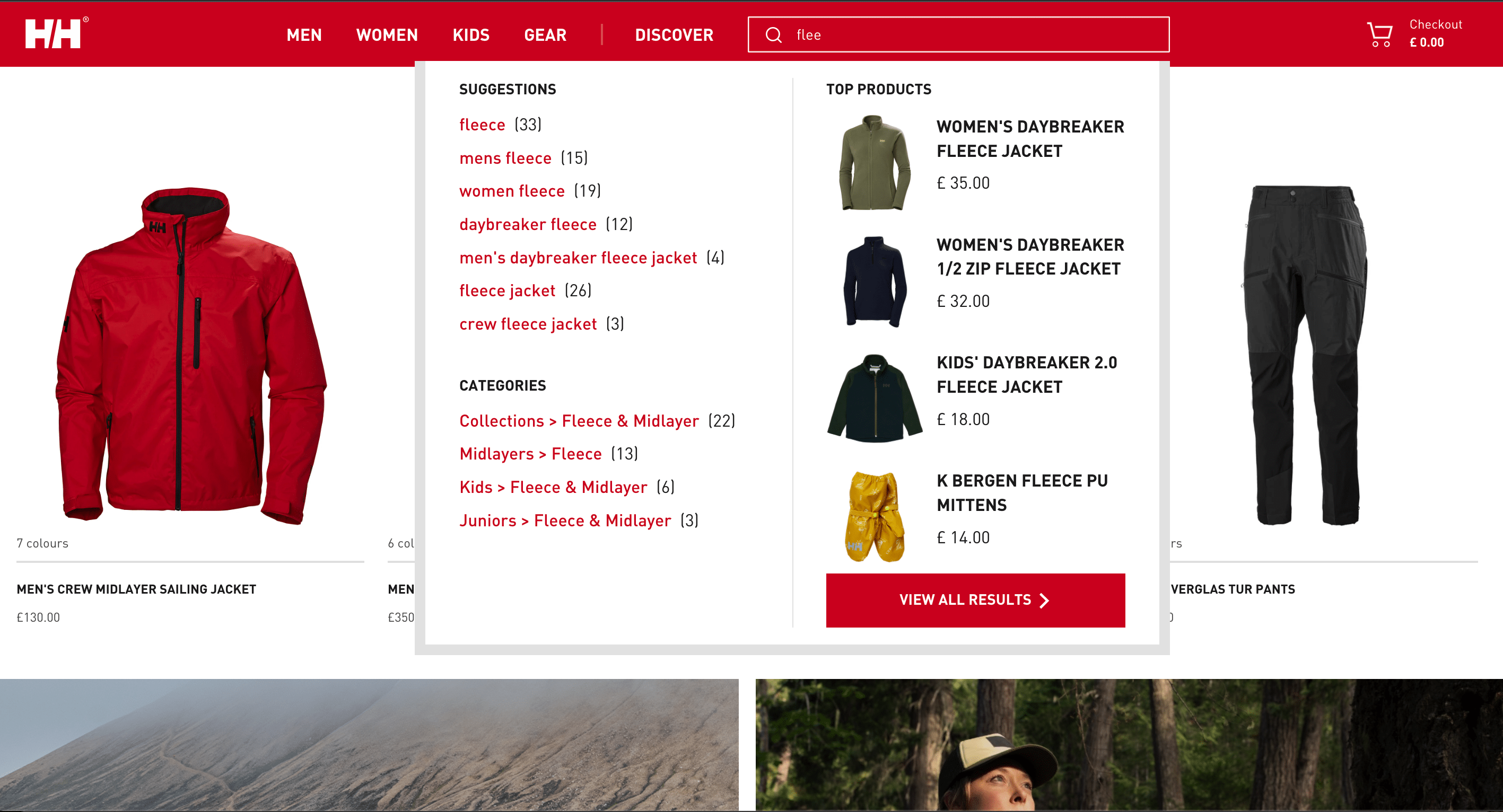
Helly Hansen is a world-leading brand of sports clothes and equipment, renowned for its high quality products. As one might expect, the company uses Magento to create unique and engaging online shopping experiences. Their product cards clearly show the various color variations while detailed thumbnails show models wearing or using the items.
This comprehensive approach allows users to quickly choose which images they’d like to see before jumping to the relevant product. On top of that, the display briskly lists all the style variations for any product.
Stop Password Masking
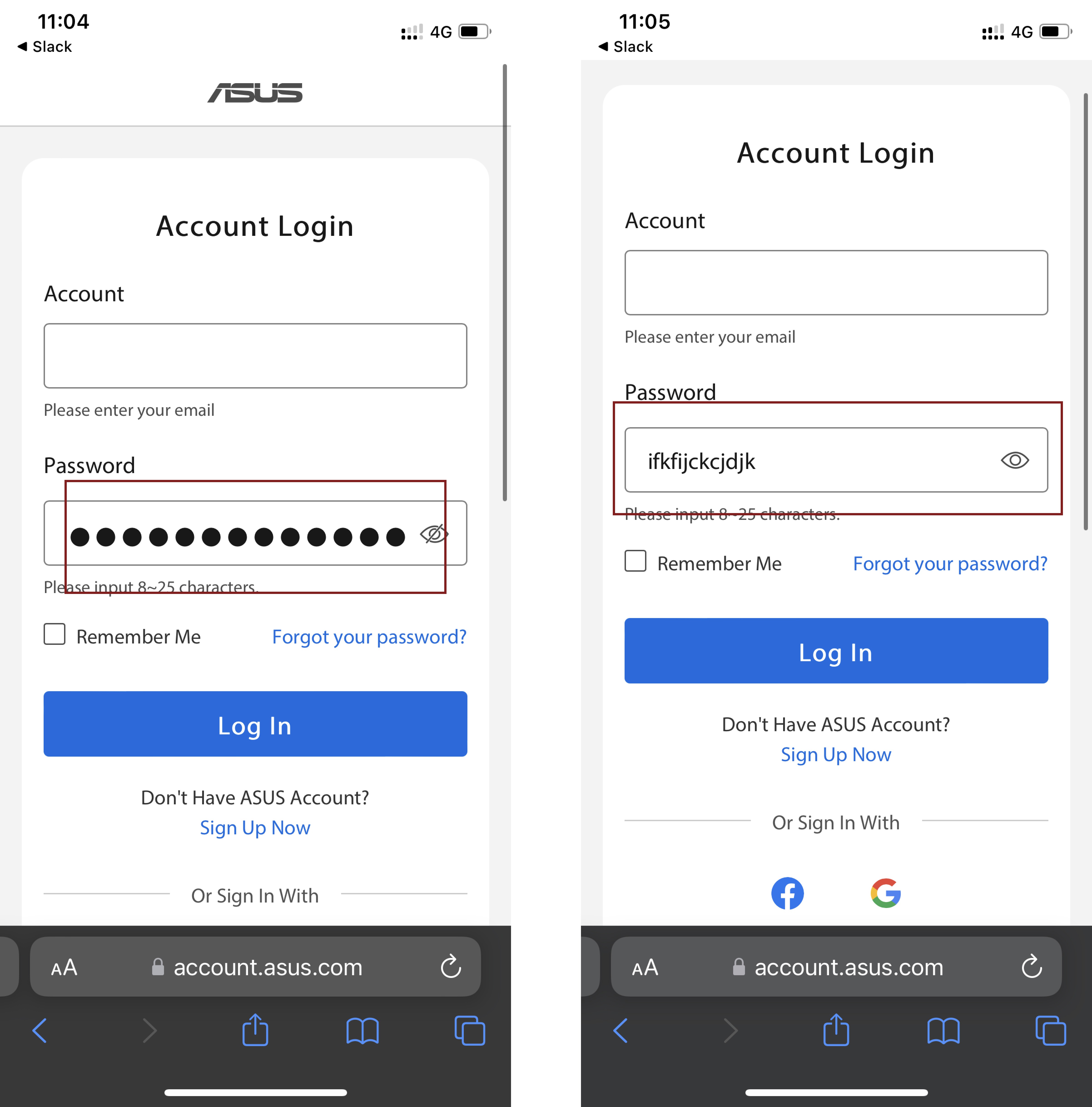
Computer company Asus is aware that website usability can suffer if the design of the login page is neglected. It’s easy for users to make a misspelling while typing a password and the only response is a row of bullets. It is especially important when a new user wants to create a new account and when repeat buyers want to log in to make a purchase. To eliminate the user’s frustrations, Asus uses a recognizable icon that allows access to the unmasked password field and ‘sees’ what is being entered. On top of that, the technology brand has attached a social login option that avoids password entry altogether and makes logging in much faster.
Feature Different Product Types on the Homepage
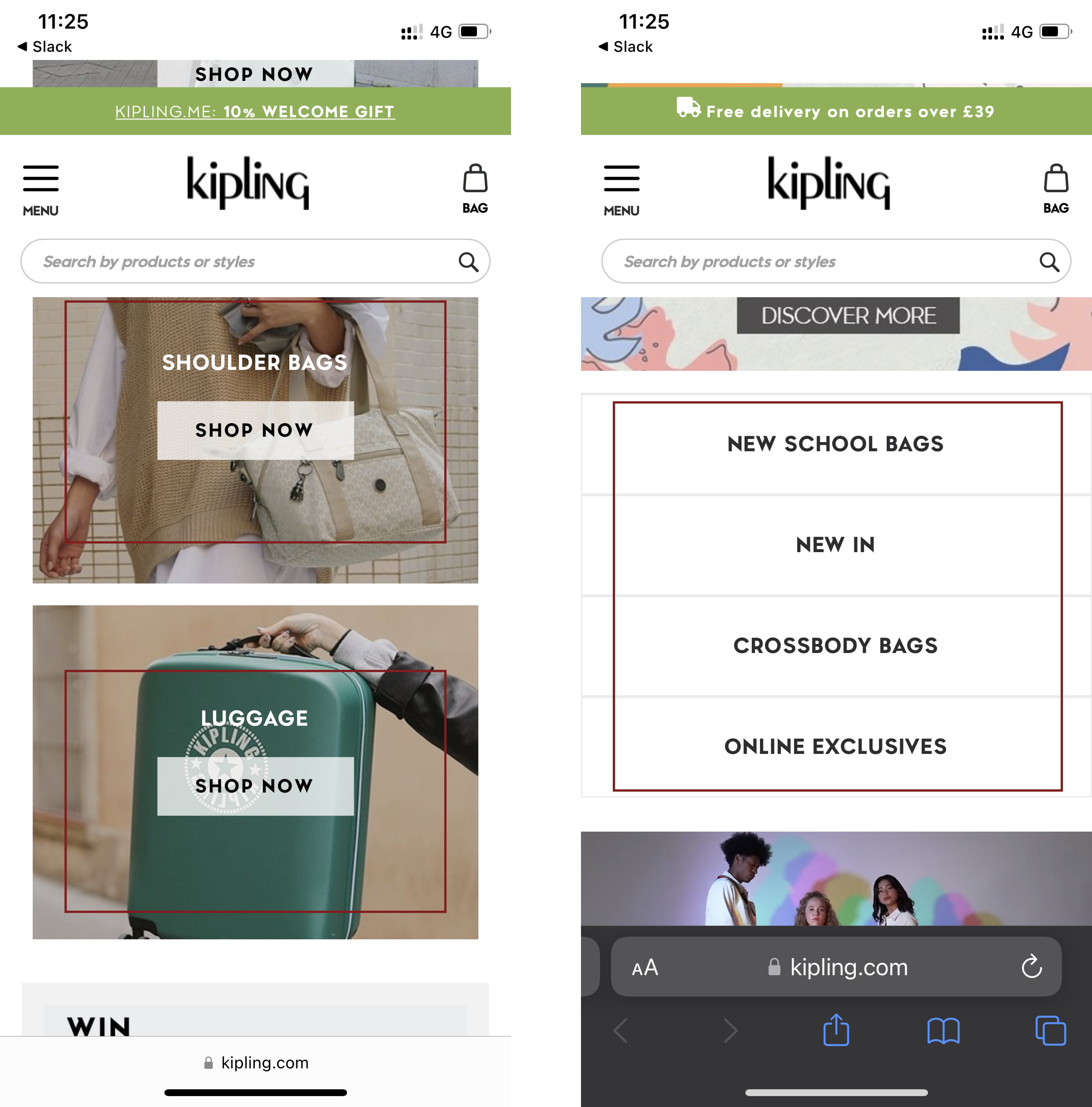
Based on a recent usability study done by Baymard Institute, first-time users rely heavily on homepage content and the main navigation options when forming an impression of a website’s product range. It’s even more important to highlight the different types of products on a mobile homepage because product categories are not permanently visible in the main navigation menu. As we can see below, the famous backpack brand Kipling were careful to feature all the main categories on their home page:
Show Detailed Customer Experiences
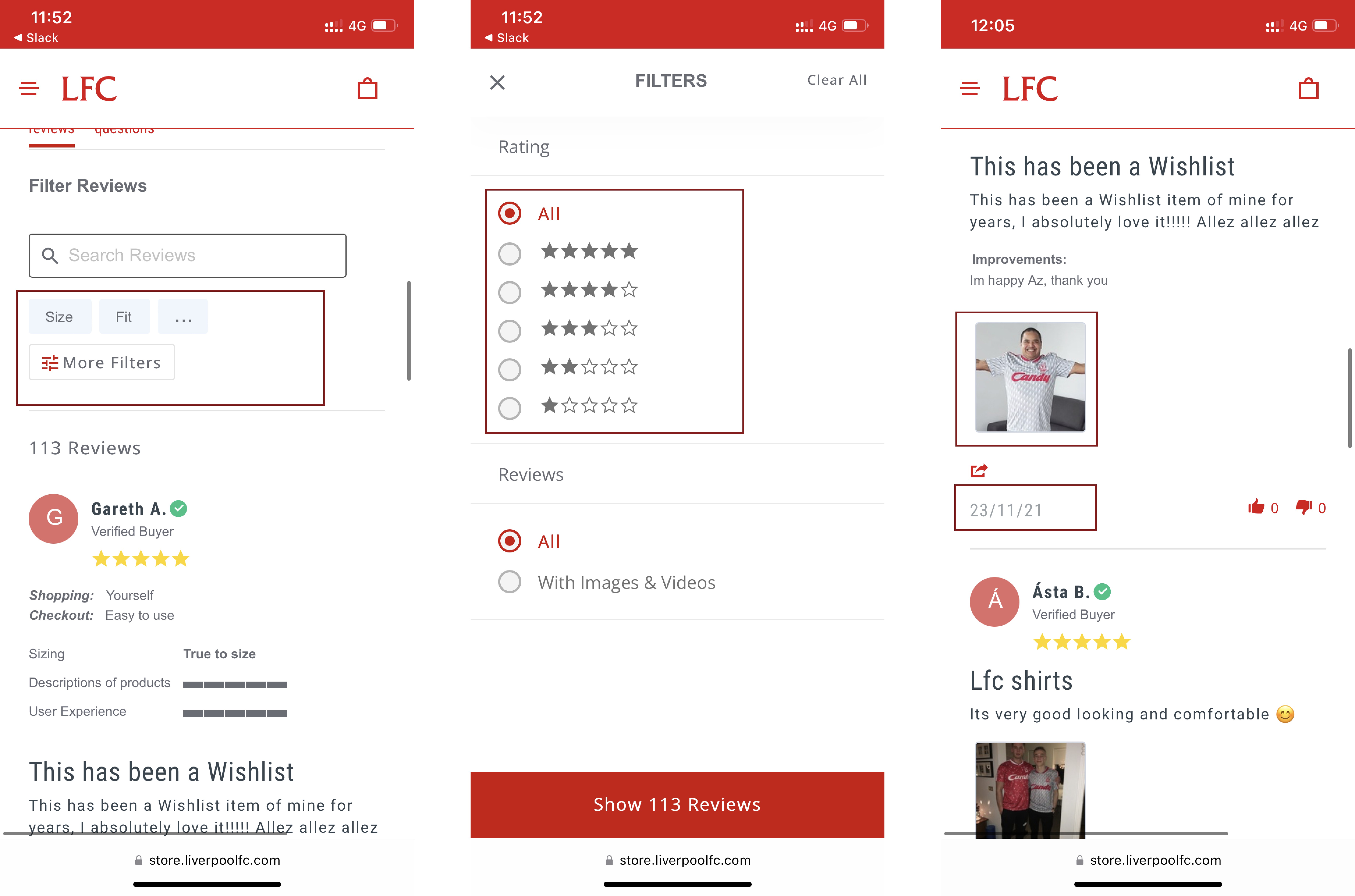
The official Liverpool FC Store succeeded in showing customer experiences by not only allowing users to read both positive and negative reviews but by allowing them to filter the reviews. Product descriptions describe product characteristics well enough, but product reviews provide insight into how products are used. On top of that users want to learn more about the buyers who left those reviews: what is their age, height and clothing size? Even more important, how exactly did they use the product? The Liverpool FC Store also makes product reviews more trustworthy by indicating the exact date they were posted and even offering images of the authors:
Display Size Variations
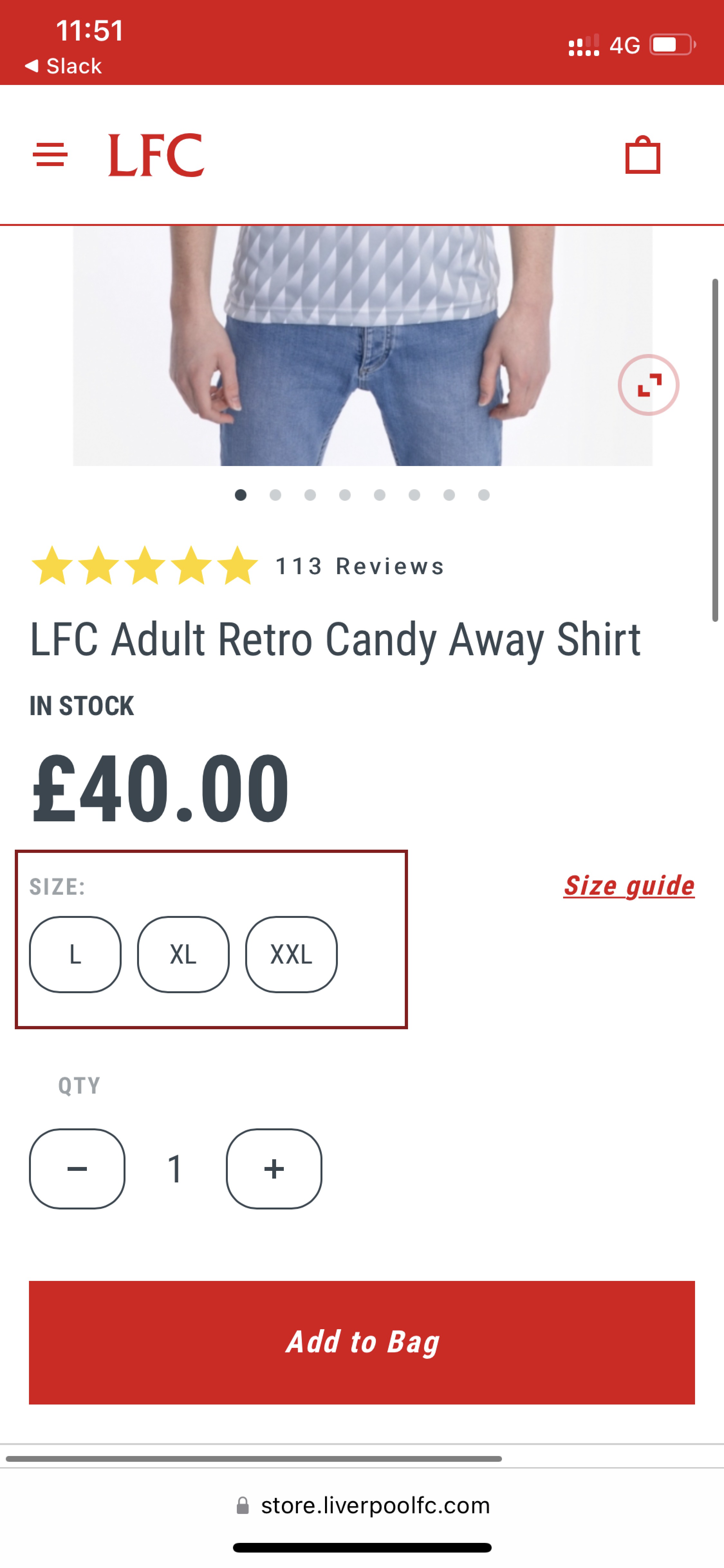
It is also worth mentioning the accessible size swatch on the product page of the Liverpool FC Store. Unlike dropdowns (which don’t show clearly what product sizes are available), these swatches show clearly what products are in or out of stock. Crucially, they are also easy to interact with on both desktop and mobile devices.
Offer Mobile-friendly Product List Filters
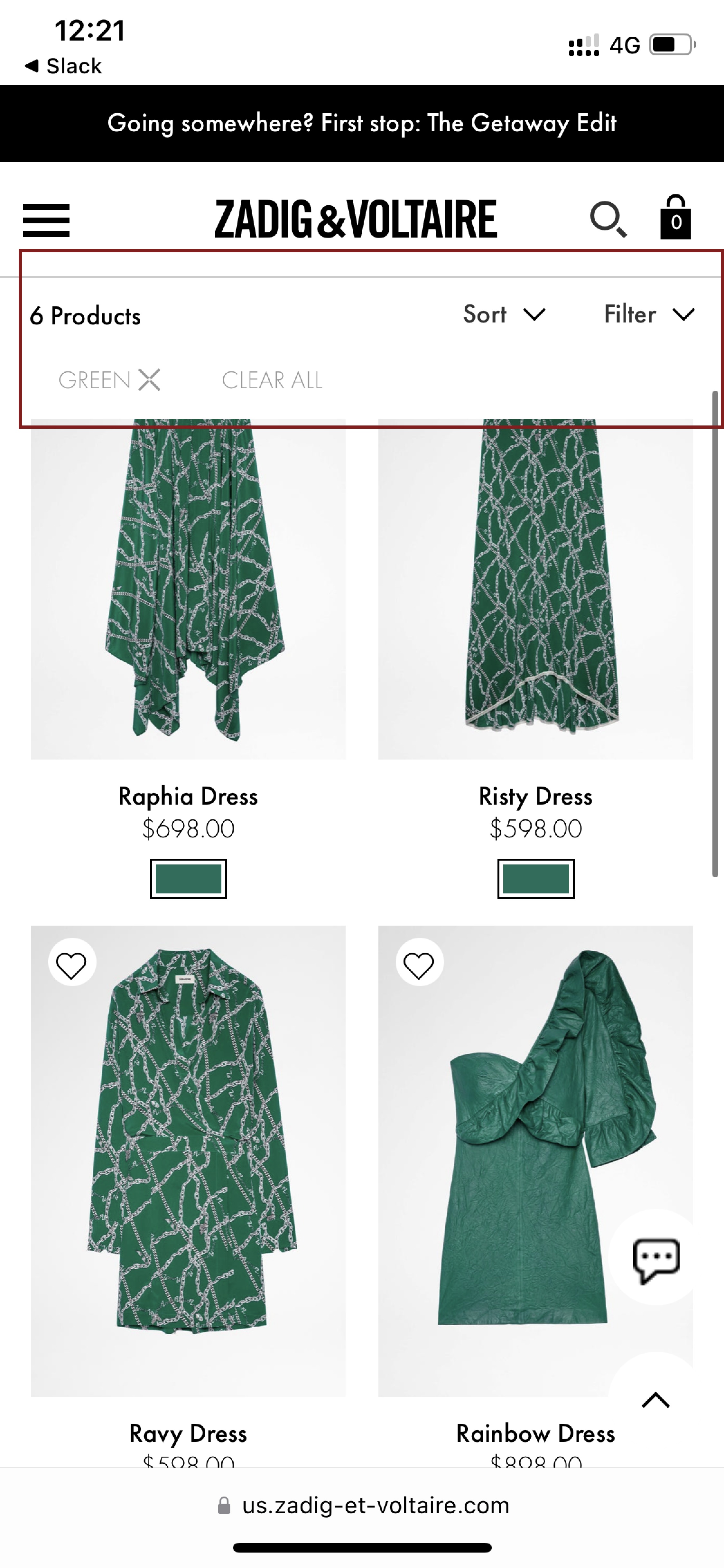
The Zadig & Voltaire designer clothing store has a great mobile-friendly product list filter. First, they keep their filter bar fixed so users can access and change the settings at any time. Secondly, the brand presents a clear overview of all the applied filters. This gives users complete control over their browsing experience and makes it easier for them to find products.
Offer Users Optimal Search Tools
If a user cannot find a product, they cannot buy it. This is why it is so important to invest in a good search tool when you are selling products online. Improving the performance of the search bar will not only help users find products faster but also guide them in constructing effective search queries.
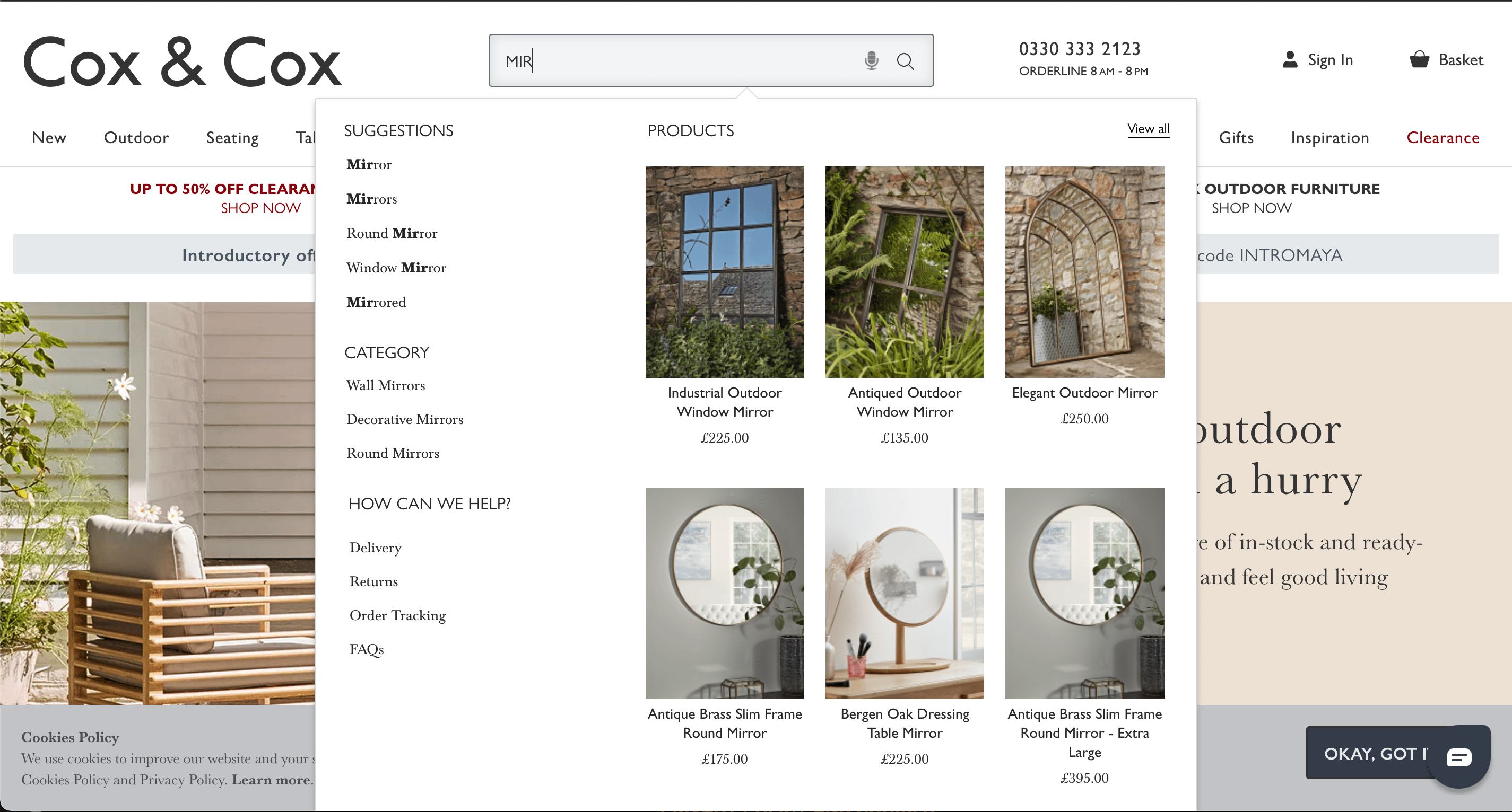
The famous homeware company Cox & Cox has applied a lot of great search solutions to their Magento-based online store. All e-commerce businesses could adopt their auto-suggestion scope, for example. This offers distinct font colors for different categories, thereby creating a dynamic contrast with the query suggestions. Such distinction makes both the suggested terms and the alternate data easier to scan, as users can distinguish the two with ease. This allows them to focus on the elements they are interested in without having to read and interpret the whole suggestion:
Offer Users Shopping Cart Clarity
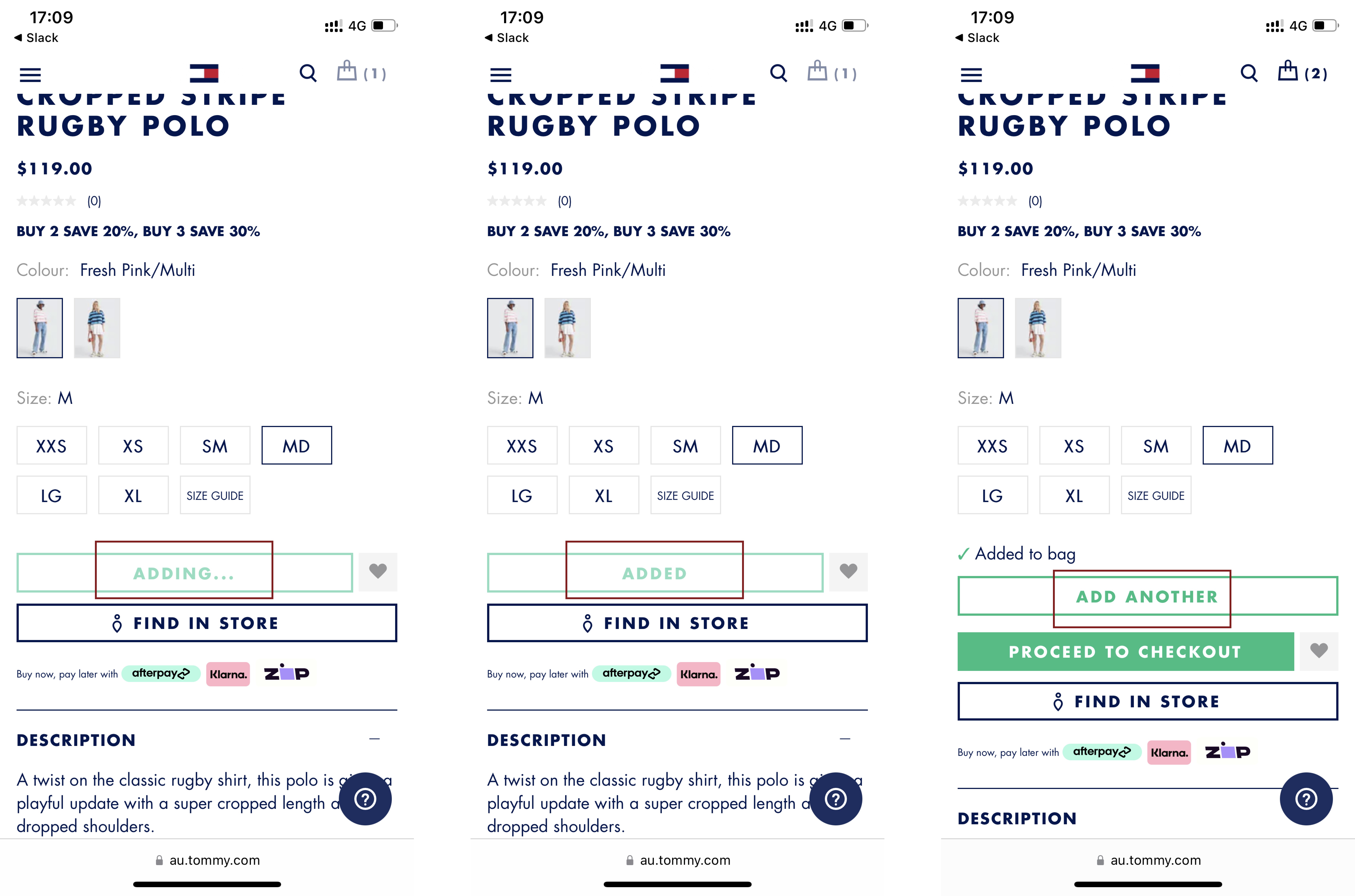
It is hugely important to demonstrate that a product has been added to a customer’s shopping cart. While many online stores use such popular approaches as showing a number badge near the shopping cart or a confirmation page, Tommy Hilfiger has added a slight animation to the text of the “Add to Cart” button. This changed the instruction to “Add Another”, providing clear and unambiguous proof that the item is already in the cart.
Design an Helpful Shopping Cart
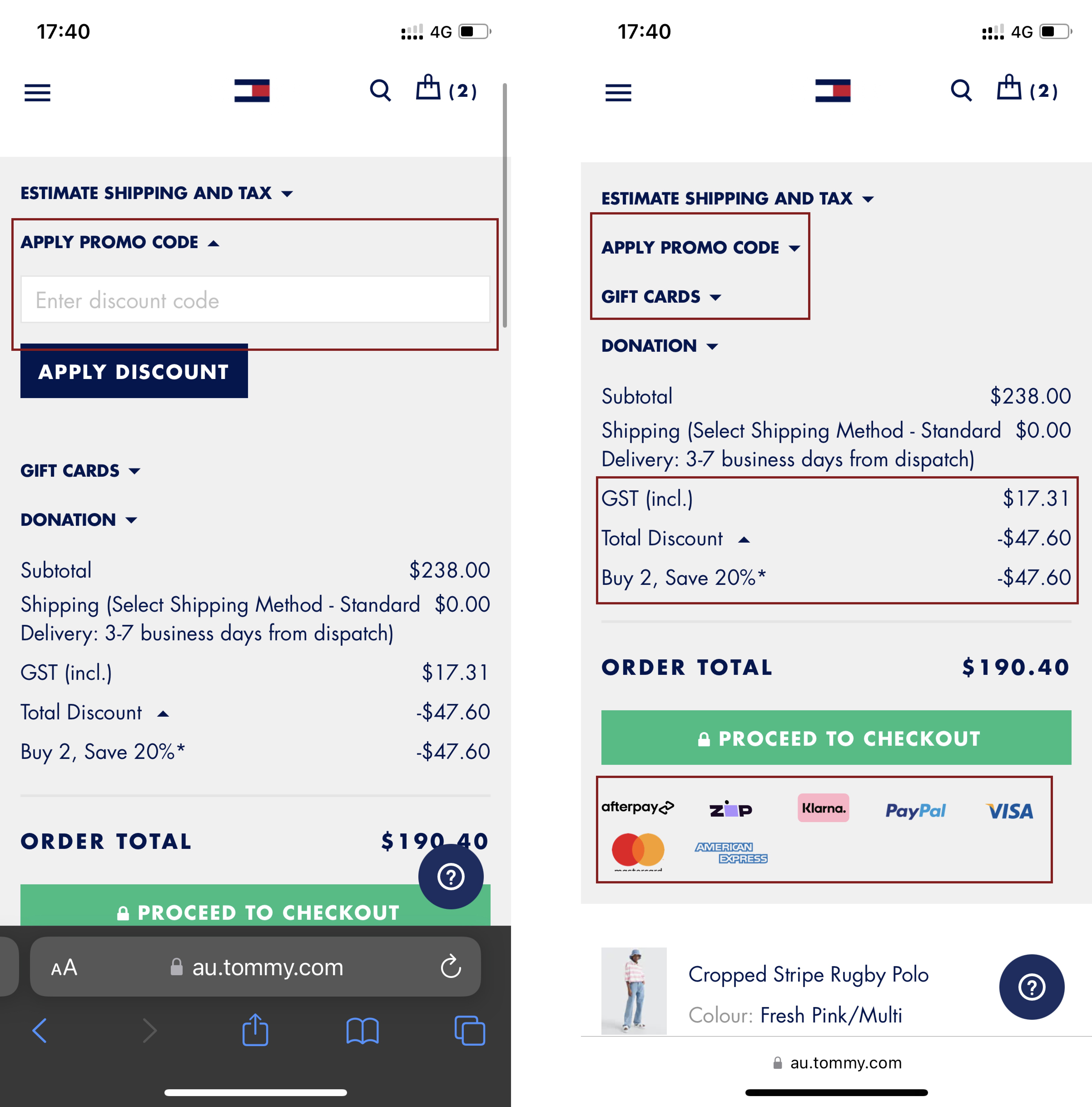
Tommy Hilfiger has designed a very engaging shopping cart, too. For example, the “Apply promo code” isn’t intrusive because it is located in the dropdown. This means users who lack a discount code won't abandon the cart at the start of the purchase process. Meanwhile, users who do possess one can apply it to their purchase very easily. Tommy’s shopping cart also displays all the supported payment options, reassuring buyers before they start the checkout process. And lastly, it’s easy for customers to find their order summary on the mobile layouts:
Offer Easy Payment Methods
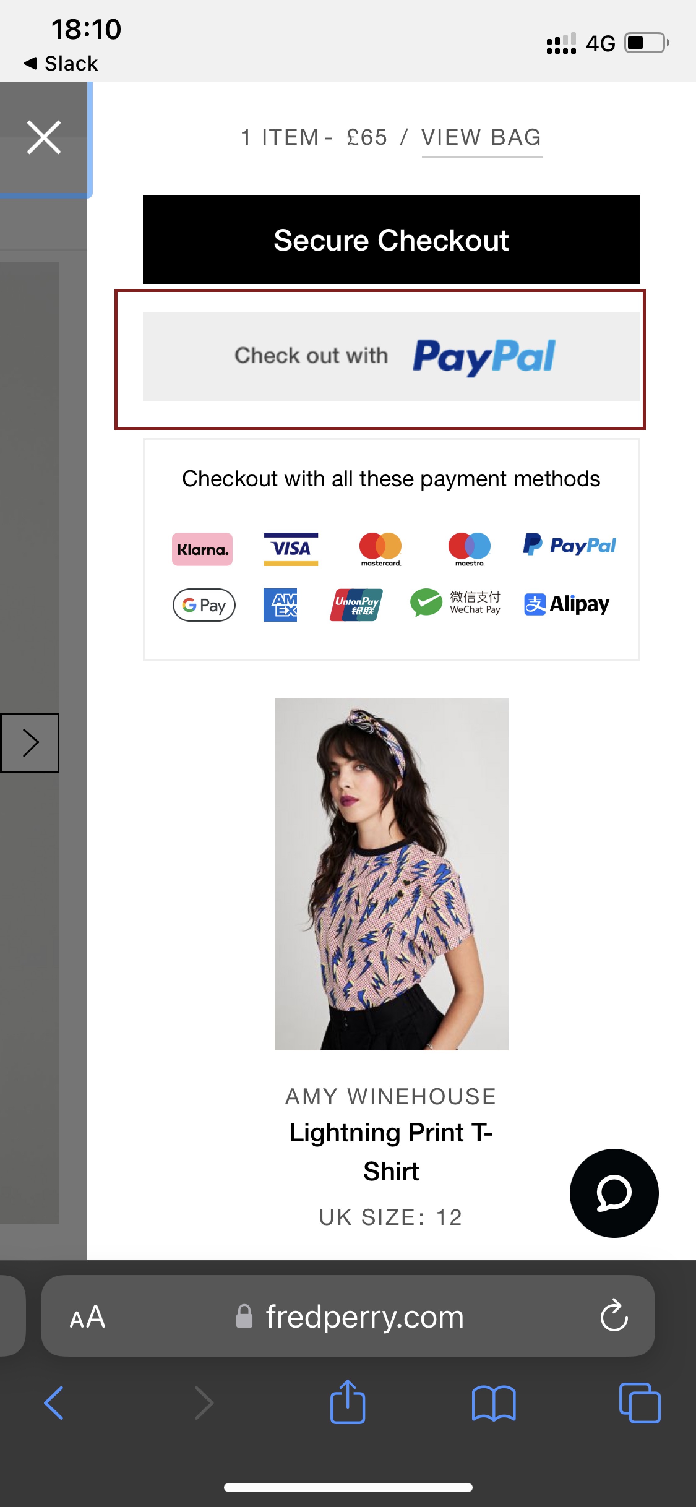
British clothing brand Fred Perry offers mobile-friendly payment options on their Magento-based website. Young buyers who prefer easy-payment options such as PayPal or Apple Pay can save them to avoid unnecessary typing in the checkout fields. Moreover, some users find this approach more secure than giving their credit card number directly to the site.
Like these Advanced Magento features? Luxinten are Here to Help!
Magento is an open source platform, capable of delivering all these advanced e-commerce features and much more. Luxinten have worked with many businesses, from world-famous brands to new startups. Founded in 2014, our experienced Magento certified experts know exactly how to deliver an optimal shopping experience against the background of an ever-evolving e-commerce landscape.
Find out more about how we can help you develop your Magento website here.
Some Key Luxinten Statistics:
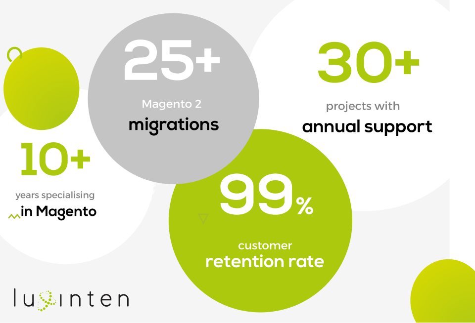
- 30+ projects with annual support
- 25+ successful full Magento 2 migrations
- 250+ solutions implemented on Magento
- 99% customer retention rate
- Adobe Certified Experts
Like this article?
Be sure to sign up to our blog feed for more insights on e-commerce.
If you want to know more about any of our services, please contact us.



Add comment...
Comments